The future of money is programmable
Securely connect to a user’s card, capture purchases in real time and trigger event-based experiences when it matters most.
Engage customers in real time
Leverage real-time payment events to create more relevant and powerful user experiences.
Build with confidence
Work on a secure, reliable platform. Fidel API has an uptime SLA of 99.99% and employs best-in-class security standards.
Reduce time to market
Embed Fidel API as a connectivity layer between your app and the major card networks. Get up and running, fast.

Fidel API in action
Build your vision
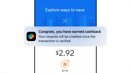
Take a look at how Google Pay uses Fidel API to reimagine how merchants and end users experience the platform.
Your trusted partner
Industry leaders in data security
A user-first approach
Put your users first with Fidel API’s consent-based approach. Your users will never be asked for bank login details or sensitive PII.
Card number tokenization
Fidel API’s proprietary token engine ensures complete user privacy and that sensitive information never gets leaked.
Streamlined compliance
Robust Card Enrollment SDKs enable you to focus on the user experience instead of managing PCI compliance requirements.
Code is our core
Designed for developers
Fidel API offers modular components and tools with rapid integrations to reduce your time to market.
- + Management dashboard
- + Webhooks
- + Detailed documentation
- + Test environment
- + Versioned API changes
- + Metadata support
- + Sample app
Fidel API Transaction Object
{
  "accountId": "4ca457bc-9092-4865-8108-123456789abc",
  "amount": 5.44,
  "auth": true,
  "authCode": "01107I",
  "brand": {
    "id": "3a4fcc58-4913-48c2-8f36-123456789abc",
    "logoURL": "https://www.riteaid.com/content/dam/riteaid-web/brand-identity/logos/rite-aid/web/RAD-Logo-RGB-large-square-open-graph.png",
    "metadata": null,
    "name": "Rite Aid"
  },
  "card": {
    "firstNumbers": "412345",
    "id": "26d81eb9-ba38-4081-89f8-123456789abc",
    "lastNumbers": "1234",
    "scheme": "visa",
    "metadata": {
        "userId": "abc123456"
    },
  },
  "cardPresent": true,
  "cleared": false,
  "created": "2022-02-23T21:17:04.650Z",
  "currency": "USD",
  "datetime": "2022-02-23T16:17:03",
  "id": "16154cba-2258-41d4-beaf-123456789abc",
  "identifiers": {
    "MID": "vop-28085064-123456789",
    "amexApprovalCode": null,
    "mastercardAuthCode": null,
    "mastercardRefNumber": null,
    "mastercardTransactionSequenceNumber": null,
    "visaAuthCode": "01107I"
  },
  "location": {
    "address": "1849 2nd Ave",
    "city": "New York",
    "countryCode": "USA",
    "geolocation": {
      "latitude": 40.7841187,
      "longitude": -73.9474606
    },
    "id": "71f9a2db-0df5-4645-9dfe-123456789abc",
    "metadata": null,
    "postcode": "10128",
    "state": null,
    "timezone": "America/New_York"
  },
  "offer": null,
  "programId": "efd1eef1-f4f4-49ba-8241-123456789abc",
  "updated": "2022-02-23T21:17:05.029Z",
  "wallet": null
}
Our customers get results
Creative solutions
Mix and match Fidel API products and add-ons to create the right solution for your business. Check out how these customers are leveraging Fidel API to move their bottom line.
Customer stories Review Fidel API’s Terms of Service to learn how you can leverage the platform.